
CDC Data: Almost Half of Newly Reported COVID-19 Deaths are 6+ Months Old
Data lags, warping all the pandemic gauges and probably causing undue policy burdens.

The CDC FINALLY updated its Case Surveillance File (explainer here). We’ll give the FULL download to subscribers by tomorrow morning but here’s what it updated:
3+ million more cases 37.5 million rows/cases in the table (don’t try this in Excel!)
Case update goes through October 22nd. For purposed of our analysis we’ll stop at September.
The data we have lags — significantly — and that lag can sometimes skew the perception of where we are in the pandemic and in turn influence policies in a negative way. So, as we detail below for full subscribers—nearly half of all newly reported deaths happened before May of 2021! And guess how many of the updated table deaths were logged all the back to 2020?
Here’s our comparative analysis against the last update which came in a month ago:
subscribers »
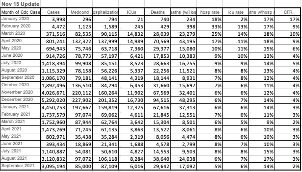
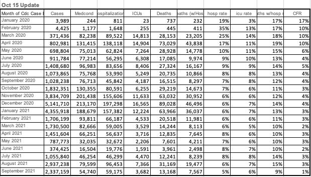
There were 49,637 COVID-19 deaths added to the database through the end of Sept 2021.
22,308 of those deaths (or 45%) occurred 6+ months ago (before May 2021!)
19,234 of those deaths (or 39%) are logged in 2020!
Screenshot of Nov 15th and then Oct 15th core stats:
Breaking it down by age (for deaths):
For 0 - 9 Years there were 84 newly reported deaths with 55 deaths @ 6+ months old and 21 new reported deaths in 2020
For 10 - 19 Years there were 224 newly reported deaths with 155 deaths @ 6+ months old and 89 new reported deaths in 2020
For 20 - 29 Years there were 630 newly reported deaths with 319 deaths @ 6+ months old and 211 new reported deaths in 2020
For 30 - 39 Years there were 1394 newly reported deaths with 426 deaths @ 6+ months old and 304 new reported deaths in 2020
For 40 - 49 Years there were 2777 newly reported deaths with 679 deaths @ 6+ months old and 493 new reported deaths in 2020
For 50 - 59 Years there were 5767 newly reported deaths with 1475 deaths @ 6+ months old and 1129 new reported deaths in 2020
For 60 - 69 Years there were 9645 newly reported deaths with 3220 deaths @ 6+ months old and 2665 new reported deaths in 2020
For 70 - 79 Years there were 11575 newly reported deaths with 5197 deaths @ 6+ months old and 4489 new reported deaths in 2020
For 80+ Years there were 17541 newly reported deaths with 10782 deaths @ 6+ months old and 9833 new reported deaths in 2020
Again, the reason we do this comparison is so you can determine how freaked out you should be about COVID-19 deaths.
More soon… we wanted to get this out there quickly.
Some interesting insights in these posts: https://probabilityandlaw.blogspot.com/2021/10/comparing-all-cause-mortality-rate-by.html and https://probabilityandlaw.blogspot.com/2021/11/is-vaccine-efficacy-statistical-illusion.html
In addition to the other suggestions (and maybe this has been done), to the best extent possible someone should create overlapping graphs to show 1) deaths by when they were reported (what we most often see), and then 2) all deaths by actual date of death. I think it would make an interesting contrast, and a good insight (hopefully) on how the severity of 'surges' as reported in the media was skewed by late data.