

This week two people with large followings had the argument that everyone in America is having at a smaller scale.
Matt Walsh, on August 5, to an audience of more than a million: the rise in grocery prices over the past six years is a mathematical reality, it hasn’t stopped or reversed, and conservatives had better come up with an answer that isn’t “learn to make cheap burritos” or they will get crushed. He also made a sharper political point — that almost no Republican was arguing the affordability crisis was fake during the Biden years, which makes the sudden discovery of statistical nuance look exactly like what it is.
Jeremy Kauffman, a bit later: as far as he can tell it simply isn’t true that food has gotten more expensive in real dollars in the United States. Why is everyone so convinced it has? Where’s the evidence? He posted a chart to back it up — food-at-home CPI divided by overall CPI, running back to 1985, wobbling in a narrow band the whole way. From 1985 to 2025, grocery prices rose 200.4% while all prices rose 199.2%. Groceries, in real terms, went up four-tenths of one percent in forty years.
Both men are arguing in good faith. Both have real data. And the reason this argument never resolves is that they are answering two different questions and both getting the right answer.
Here’s the referee.
First, the thing nobody disputes
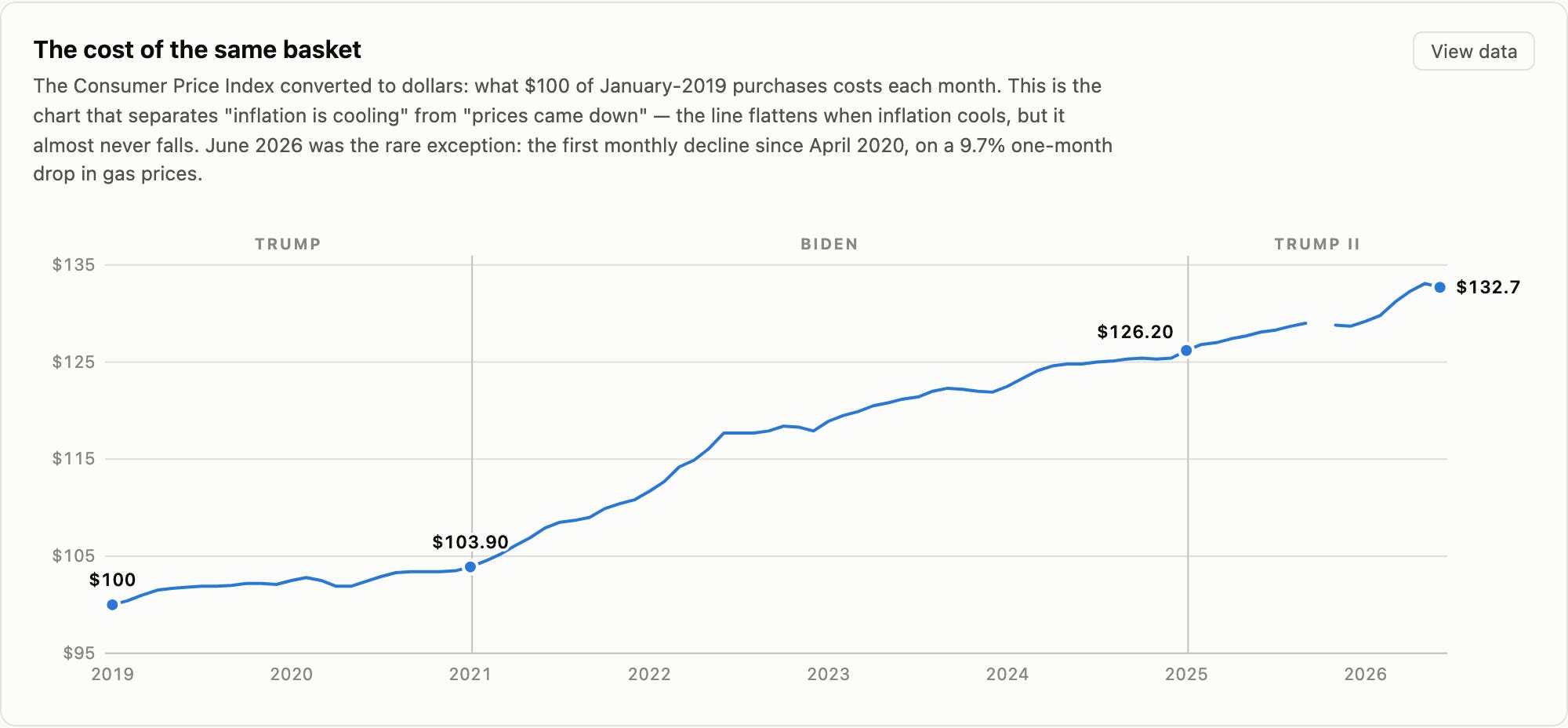
A basket of goods that cost $100 in January 2019 cost $103.90 the day Joe Biden was inaugurated. It cost $126.20 the day Donald Trump returned. As of June 2026, it costs $132.70.
That line essentially never goes down. June 2026 delivered the first monthly decline since April 2020 — down 0.4%, driven almost entirely by a 9.7% one-month collapse in gasoline after the spring’s Iran-war oil spike faded. One month, after six years.
This is the part people mean when they say prices went up and never came back. They’re right. Disinflation is not deflation. When a 9.1% inflation rate falls to 3%, prices are still rising — just more slowly, from a level that never returned.
Kauffman’s ground, and it’s solid
The strongest possible version of the “it’s flat” argument isn’t a price index at all. It’s work-time: how many minutes does the average private-sector worker have to labor to buy a thing? No index, no deflator, no chained-dollar methodology to argue about. Price divided by hourly wage.
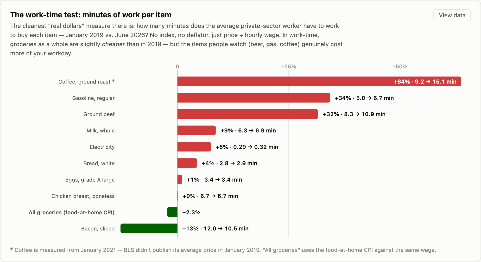
Run every item that way from January 2019 to June 2026 and groceries as a whole cost 2.3% less work time than they did before COVID. Bacon is down 13%. Chicken breast is exactly flat. Eggs — after the entire avian-flu round trip — are up one percent.
Kauffman is right. In aggregate, measured the cleanest way available, the American grocery basket has roughly kept pace with the American paycheck. Zoom out to his forty-year window and the case is stronger still: by USDA’s accounting, food’s share of household income fell for half a century.
Anyone claiming groceries have become categorically unaffordable relative to wages is, on the aggregate numbers, wrong.
Walsh’s ground, and it’s also solid
Now look at the same chart again, at the top instead of the bottom.
Coffee costs 64% more work time. Gasoline costs 34% more — 5.0 minutes a gallon in 2019, 6.7 minutes now. Ground beef costs 32% more work time: 8.3 minutes a pound then, 10.9 minutes now. Milk is up 9%, electricity 8%, bread 4%.
That’s the same dataset producing the opposite headline, and neither number is wrong. The average is flat because bacon and chicken and eggs pull down while beef and gas and coffee pull up.
Nobody buys the average. Households buy specific things, notice specific prices, and anchor hardest on the items they purchase most often and see most clearly — the gallon of gas on the illuminated sign, the pound of ground beef, the morning coffee. Those are precisely the items that got worse.
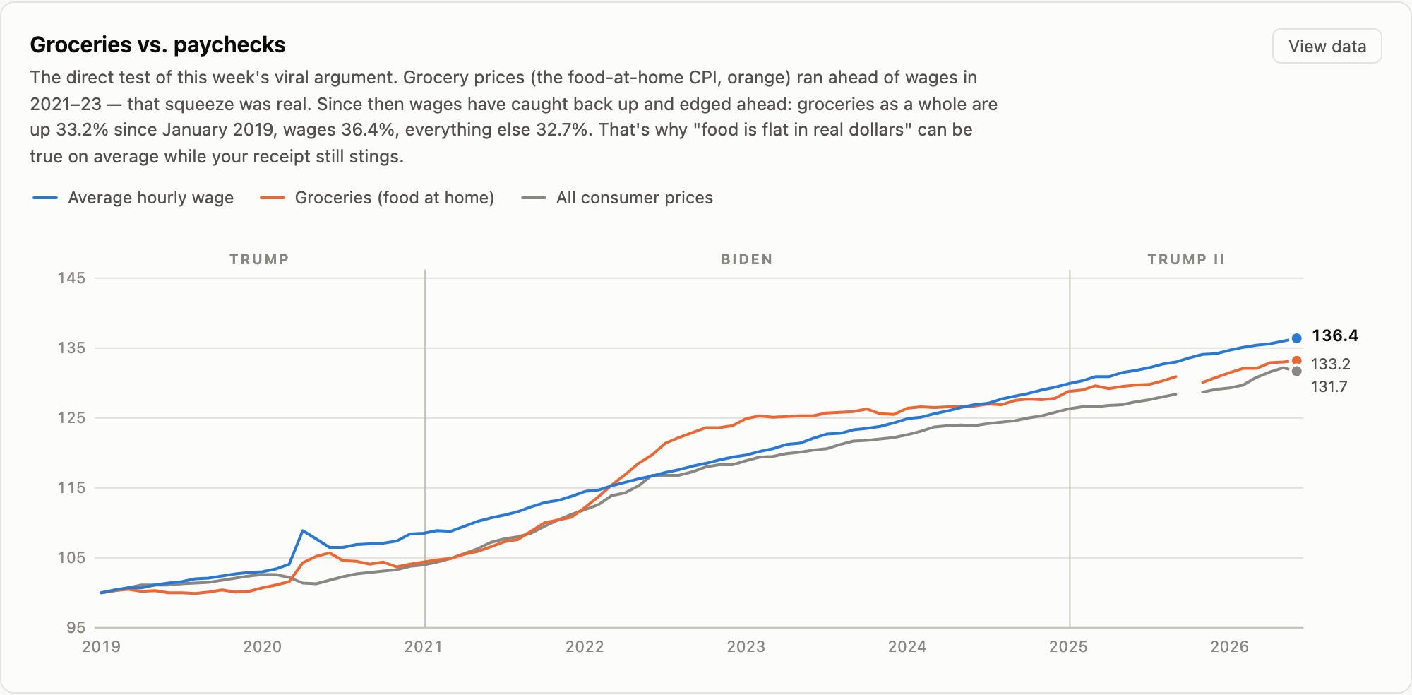
And there was a genuine squeeze, not a perceived one. Food-at-home prices have risen 33.2% since January 2019 against wages up 36.4% — but the path matters more than the endpoint. The food line ran above the wage line from 2021 into 2023. For roughly two years, groceries outran paychecks. Measured from January 2021, food still costs about 1.4% more work time today than it did then.
USDA’s own numbers say Americans spent 11.3% of household income on food in 2022 — the highest share since 1991. That is not a vibe. That is the statistic Kauffman’s forty-year trend line smooths away.
The whole argument is a fight about start dates
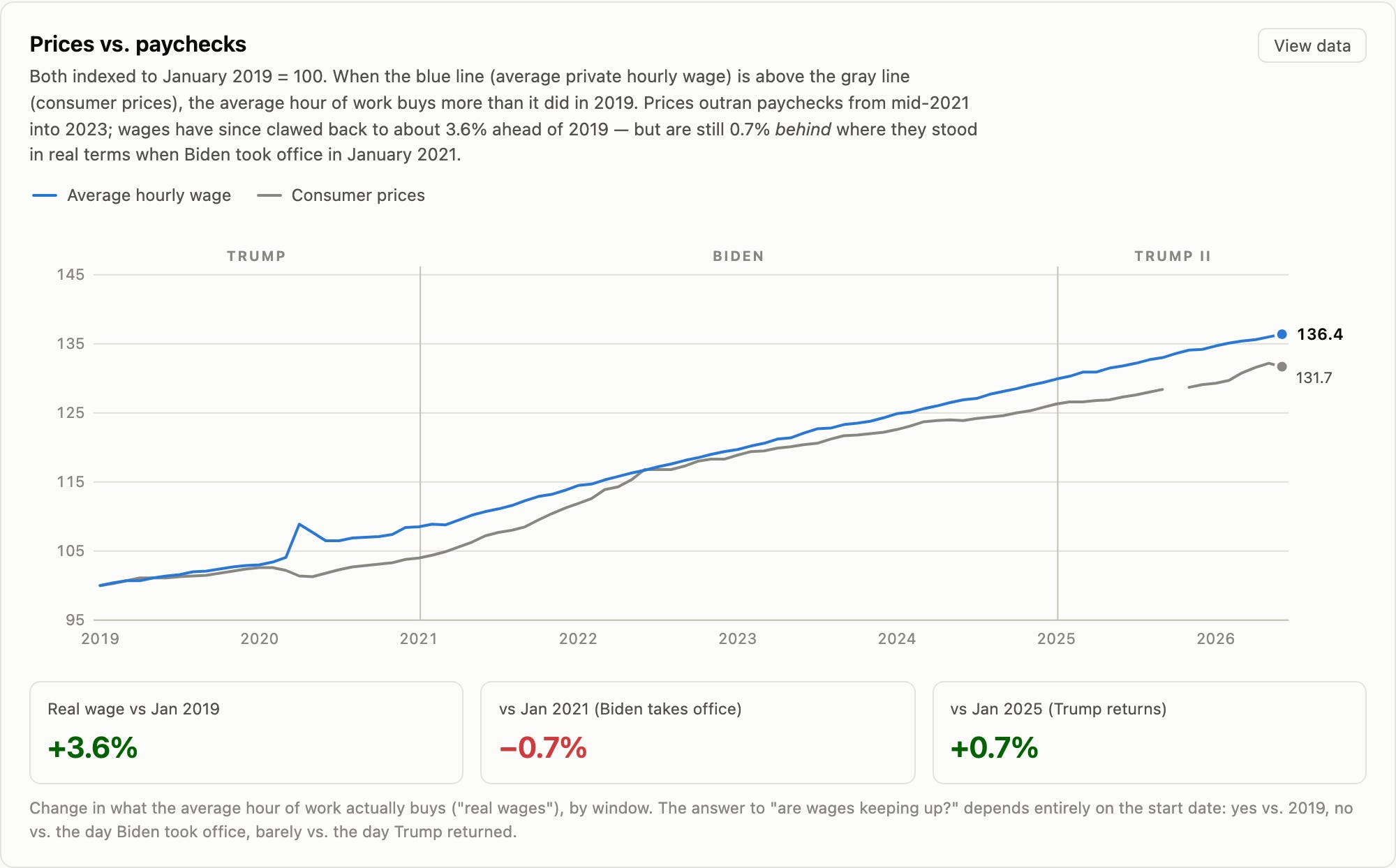
Ask whether wages are keeping up with prices and the honest answer is: compared to when?
Against January 2019, the average hour of work buys 3.6% more.
Against January 2021, it buys 0.7% less.
Against January 2025, it buys 0.7% more.
Three defensible answers, three different starting lines, one dataset. Pick 2019 and you get Kauffman’s story. Pick 2021 and you get Walsh’s. Neither is cherry-picking in bad faith; they’re just standing in different places.
Kauffman’s own chart concedes this if you read the table under it. Over 1985–2025 real grocery prices rose 0.4%. But over February 2020 to June 2026 they rose 2.1%, and over June 2021 to June 2026, 1.7%. His long trend is real and his recent numbers point the other way, which is precisely the shape of the disagreement.
The full tab
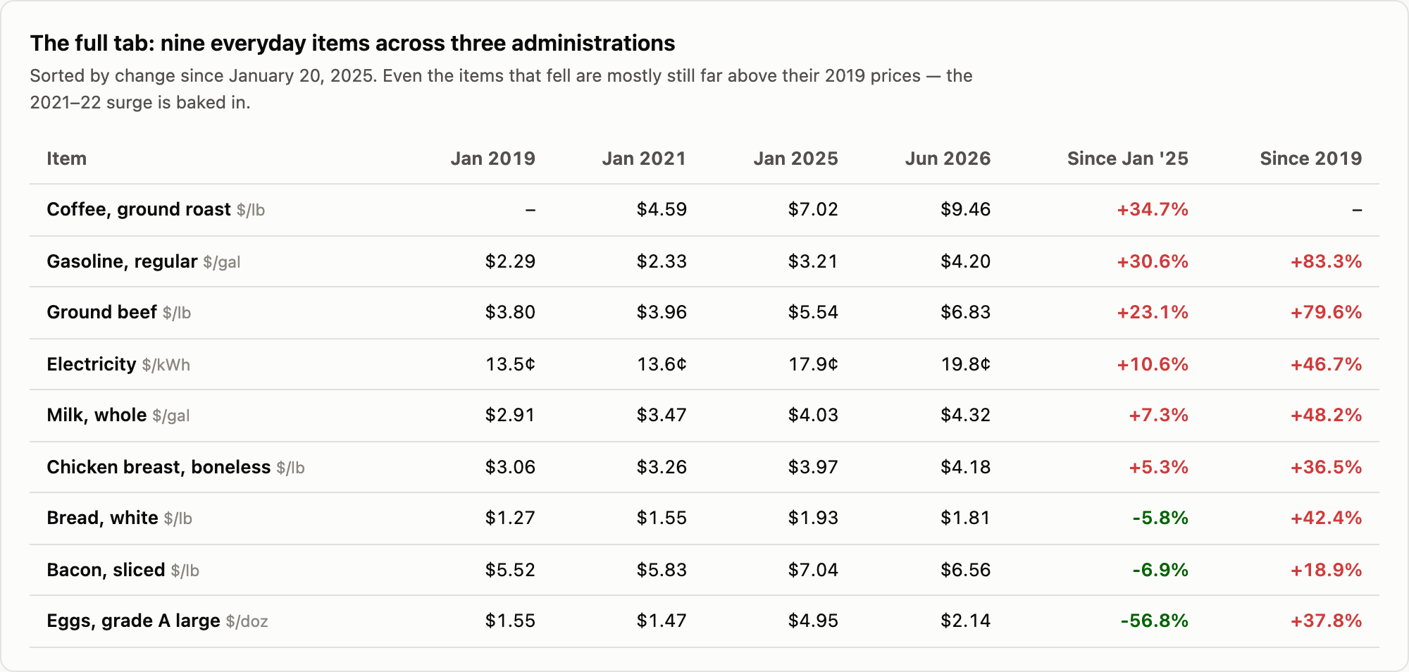
Since January 2025: coffee +35% — a record $9.72 a pound in April 2026, driven by Brazilian and Vietnamese droughts plus tariffs. Gasoline +31%, from $3.21 to $4.20, with a $4.65 peak in May 2026 during the Iran conflict. Ground beef +23% to a record $6.90 a pound on the tightest cattle supply in decades. Electricity +11%, a record 19.8 cents per kilowatt-hour. Milk +7%. Chicken +5%.
Down: eggs −57%, from $4.95 to $2.14.
Be careful with that last one, because it’s the number you’ll hear most. It’s real — and it’s an avian-flu round trip. Eggs spiked to $6.23 in March 2025 and came back down. Measured against 2019, eggs are still up 38%.
Which is the pattern for everything. Against 2019: gas +83%, beef +80%, milk +48%, electricity +47%, bread +42%, eggs +38%, chicken +37%, bacon +19%.
Nothing on that list is back to 2019 prices. Not one item.
The scoreboard, presented straight
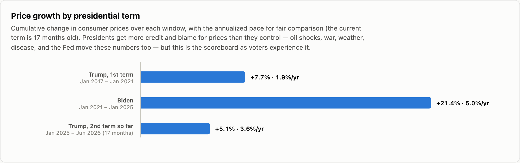
Inauguration month to inauguration month:
Trump’s first term: +7.7% over four years — 1.9% a year.
Biden: +21.4% over four years — 5.0% a year.
Trump’s second term so far: +5.1% over seventeen months — about 3.6% a year annualized.
Better than Biden. Worse than Trump I. That’s the receipt, and we’re publishing it in that order because the alternative is doing exactly what Walsh warned about.
The obligatory caveat, stated once: presidents don’t set prices. Avian flu set the egg price. Cattle herd cycles set the beef price. Brazilian weather set the coffee price. A war near the Strait of Hormuz set the May gasoline price. The Federal Reserve matters more than any of them. Attributing a CPI print to whoever occupies the White House is bad economics regardless of who benefits from it that month.
But the scoreboard is the scoreboard, and voters are going to keep it whether or not economists approve.
The verdict
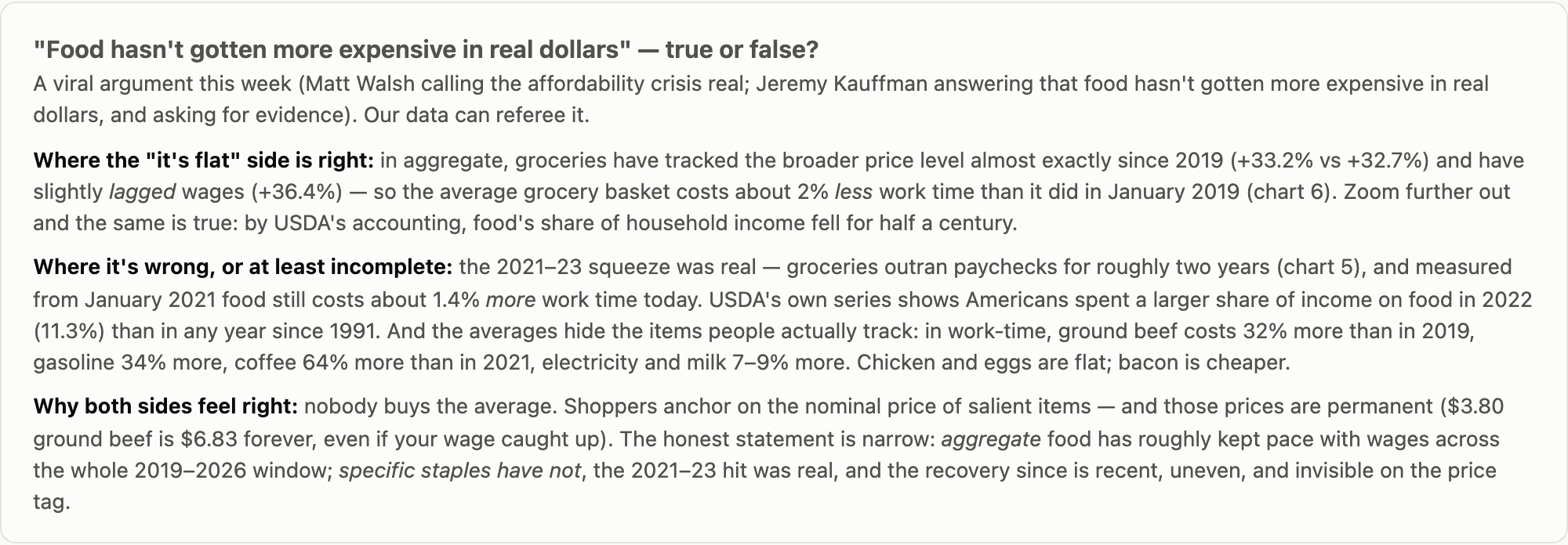
The honest statement is narrower than either side’s tweet, and here it is:
Aggregate food has roughly kept pace with wages across the full 2019–2026 window. Specific staples have not. The 2021–23 squeeze was real. And the recovery since is recent, uneven, and completely invisible on the price tag.
That last clause is the one that decides the political argument.
Even where wages have caught up, the nominal price is permanent. Ground beef that cost $3.80 costs $6.83, and it will cost $6.83 forever, no matter what happens to your paycheck. The wage recovery arrives as a number on a pay stub you see twice a month. The price increase arrives every single time you stand at a register. One of those is salient and one of them isn’t, and no amount of correct math changes which is which.
So Kauffman’s question — where’s the evidence? — has an answer: it’s in chart six, at the top of the list, in the items people actually watch. And Walsh’s warning has an answer too: the aggregate data really does show groceries roughly tracking wages, and pretending otherwise is its own kind of dishonesty.
But Walsh is right about the politics in a way that transcends the statistics. Telling people that their lived experience is a measurement artifact is a losing argument even when the measurement is correct. It was a losing argument when the Biden administration made it in 2022 with “Bidenomics,” and it will be a losing argument for anyone who makes it in 2026. The winning move is to say the true thing: some prices genuinely outran you, the squeeze was real, and here is what we intend to do about the ones still climbing.
Sources: BLS Consumer Price Index (CPI-U, 12-month change, not seasonally adjusted) and BLS average price data for all shelf prices; average hourly earnings of private employees; USDA ERS food expenditure series; FRED series including CUUR0000SAF11 for food at home. Data retrieved August 4–5, 2026, running through June 2026. Coffee work-time is measured from January 2021 because BLS did not publish an average price for it in January 2019. October 2025 CPI was never published because of the government shutdown; our charts show the gap rather than interpolating across it.
Every number above is explorable. Hover any point, open any “view data” table, and check the months yourself — the full interactive price page is here →
Avian flu didn’t drive up egg prices. Our dipshit bureaucrats did—when they ordered the mass culling of healthy chickens over the so-called avian flu.
Excellent work - I wonder if the same sort of analysis would clarify the housing affordability debate? Since real estate prices vary widely from one location to another I suspect one would have to pick a single location.
Thanks for your work!